Styling your app
Dioxus uses standard HTML and CSS for styling, making it easy to leverage existing CSS frameworks, libraries, and knowledge. This chapter covers the various approaches to styling your Dioxus applications, from inline styles to CSS frameworks like TailwindCSS.
Dioxus uses CSS for Styling
Unlike many other UI frameworks that introduce their own styling systems, Dioxus embraces the web's native styling approach: HTML and CSS. This means you can use all the CSS knowledge, tools, and frameworks you already know and love.
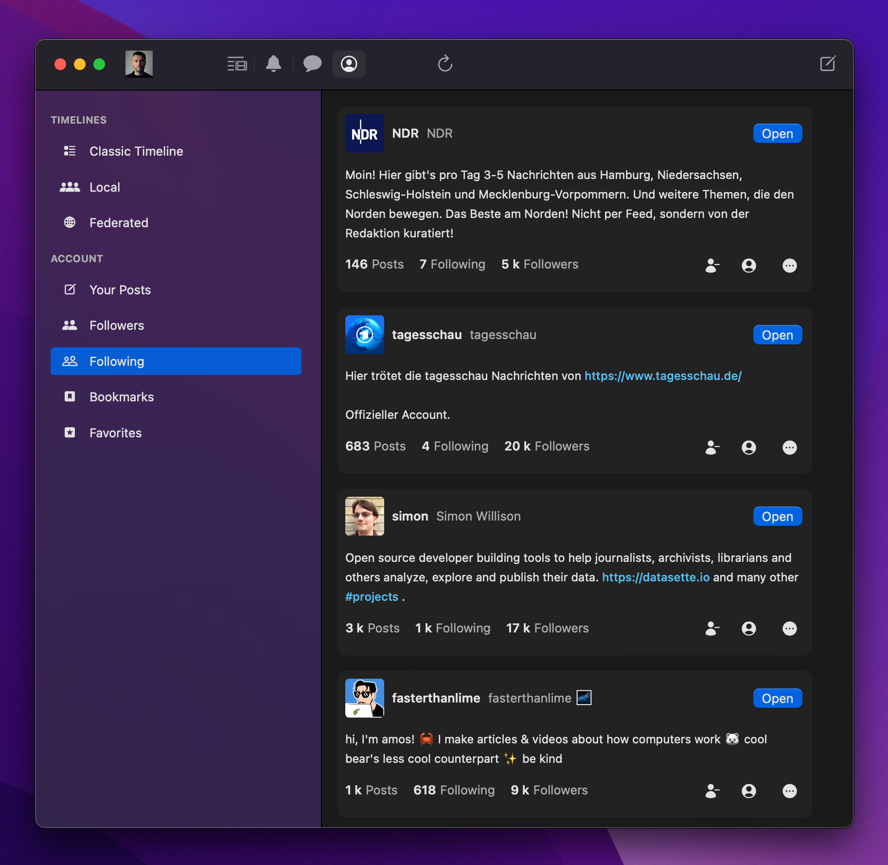
CSS is by-far the most popular styling system and is extremely capable. For example, here's a screenshot of ebou, a very beautiful Mastodon client built with Dioxus.

All 1st-party Dioxus renderers leverage CSS, but other renderers like Freya might use their own style system. Dioxus automatically converts your CSS to the appropriate native widget properties when applicable, though in some cases you might need to write platform-specific code to achieve your ideal native look and feel.
Inline CSS
The simplest way to add styles to your elements is through inline CSS using the HTML style attribute. Simply write your CSS styles in an inline string:
use dioxus::prelude::*;

fn App() -> Element {
    rsx! {
        div {
            style: "background-color: blue; color: white; padding: 20px; border-radius: 8px;",
            "This is a styled div!"
        }
    }
}
For better ergonomics, Dioxus also allows you to set individual CSS properties directly as attributes. CSS property names are referenced via their snake_case variant:
fn App() -> Element {
    rsx! {
        div {
            background_color: "blue",
            color: "white",
            padding: "20px",
            border_radius: "8px",
            "This is a styled div!"
        }
    }
}
Because CSS properties are attributes, you can make them dynamic by using Rust expressions:
fn App() -> Element {
    let mut is_dark = use_signal(|| false);

    rsx! {
        div {
            background_color: if is_dark() { "black" } else { "white" },
            color: if is_dark() { "white" } else { "black" },
            padding: "20px",
            onclick: move |_| is_dark.toggle(),
            "Click to toggle theme"
        }
    }
}
Stylesheets
For larger applications, it's better to organize your styles in separate CSS files. Dioxus provides excellent support for CSS stylesheets through the asset!() macro.
Including CSS Files
Create a CSS file in your assets directory and include it using the asset!() macro. Dioxus provides two "document" elements - document::Link and document::Stylesheet:
use dioxus::prelude::*;

// Define the CSS asset
static MAIN_CSS: Asset = asset!("/assets/main.css");

fn App() -> Element {
    rsx! {
        // Include the stylesheet in the document head
        document::Stylesheet { href: MAIN_CSS }

        div {
            class: "my-component",
            "Hello, styled world!"
        }
    }
}
Note that a regular <link> element will work, though it won't be marked as pre-loadable when used with server-side-rendering:
rsx! {
    link { href: asset!("/assets/main.css") }
}
Your assets/main.css file might look like:
.my-component {
    background-color: #f0f9ff;
    border: 2px solid #0ea5e9;
    border-radius: 8px;
    padding: 16px;
    font-family: system-ui, sans-serif;
}

.my-component:hover {
    background-color: #e0f2fe;
    transform: translateY(-2px);
    transition: all 0.2s ease;
}
CSS Selectors
To use the style declarations from our stylesheet, we can use class selectors and ID selectors:
.my-component {
    background-color: #f0f9ff;
}
#root-component {
    font-weight: 500;
}
rsx! {
    div {
        id: "root-component",
        class: "my-component"
    }
}
CSS provides several selectors that you can leverage in your stylesheets:
- Element selectors (
div,p,h1): Target HTML elements by their tag name - Class selectors (
.my-class): Target elements with a specific class attribute - ID selectors (
#my-id): Target a single element with a specific ID attribute - Attribute selectors (
[type="text"]): Target elements based on their attributes - Descendant selectors (
div p): Target elements that are descendants of another element - Child selectors (
div > p): Target direct children of an element - Adjacent sibling selectors (
h1 + p): Target elements immediately following another - General sibling selectors (
h1 ~ p): Target elements that are siblings of another - Pseudo-class selectors (
:hover,:focus,:nth-child()): Target elements in specific states - Pseudo-element selectors (
::before,::after): Target virtual elements or parts of elements - Universal selector (
*): Target all elements - Grouping selectors (
h1, h2, h3): Apply styles to multiple selectors at once
Conditional Styles with Classes
The HTML class attribute supports conditional styling and can be defined multiple times on the same element:
fn App() -> Element {
    let mut is_active = use_signal(|| false);
    let mut is_large = use_signal(|| false);

    rsx! {
        button {
            class: "btn",
            class: if is_active() { "btn-active" },
            class: if is_large() { "btn-large" },
            onclick: move |_| is_active.toggle(),
            "Toggle me!"
        }
    }
}
In HTML, the class attribute specifies a list of CSS classes a particular element has. A corresponding CSS stylesheet might include several classes that your elements use:
/* The base `btn` class the button uses */
.btn {
    background-color: #f3f4f6;
    border: 1px solid #d1d5db;
    border-radius: 6px;
    padding: 8px 16px;
    font-size: 14px;
    font-weight: 500;
    cursor: pointer;
    transition: all 0.2s ease;
}

/* The "active" class, added when `is_active()` is true */
.btn-active {
    background-color: #3b82f6;
    color: white;
    border-color: #2563eb;
}

/* The "large" class, added when `is_large()` is true */
.btn-large {
    padding: 12px 24px;
    font-size: 16px;
}
CSS Custom Properties for Theming
You can use CSS custom properties (variables) for consistent theming. This is generally preferred over using Rust variables since dynamic string formatting can be less efficient and harder to optimize.
:root {
    --color-primary: #3b82f6;
    --color-primary-hover: #2563eb;
    --color-text: #1f2937;
    --color-background: #ffffff;
    --border-radius: 6px;
    --spacing-xs: 4px;
    --spacing-sm: 8px;
    --spacing-md: 16px;
    --spacing-lg: 24px;
}

.button {
    background: var(--color-primary);
    color: var(--color-background);
    padding: var(--spacing-sm) var(--spacing-md);
    border-radius: var(--border-radius);
    border: none;
    cursor: pointer;
}

.button:hover {
    background: var(--color-primary-hover);
}
SCSS
Dioxus supports SCSS (Sass) files out of the box. Simply use the asset!() macro with .scss files:
static STYLES: Asset = asset!("/assets/styles.scss");
Your assets/styles.scss file can use all SCSS features:
$primary-color: #3b82f6;
$secondary-color: #64748b;
$border-radius: 8px;

.card {
    background: white;
    border-radius: $border-radius;
    box-shadow: 0 1px 3px rgba(0, 0, 0, 0.1);

    &:hover {
        box-shadow: 0 4px 6px rgba(0, 0, 0, 0.1);
    }

    .header {
        background: $primary-color;
        color: white;
        padding: 16px;
        border-radius: $border-radius $border-radius 0 0;
    }

    .content {
        padding: 16px;
        color: $secondary-color;
    }
}
Tailwind
Tailwind CSS is a popular utility-first CSS framework that works excellently with Dioxus. It allows you to style elements using pre-defined utility classes. This very documentation site uses Tailwind! We can simply use tailwind classes in Dioxus:
rsx! {
    div { class: "flex flex-col items-center p-7 rounded-2xl",
        img { class: "size-48 shadow-xl rounded-md", src: "/img/cover.png" }
        div { class: "flex",
            span { "Class Warfare" }
            span { "The Anti-Patterns" }
            span { class: "flex",
                span { "No. 4" }
                span { "·" }
                span { "2025" }
            }
        }
    }
}
As of Dioxus 0.7, DX automatically downloads and starts the TailwindCSS watcher for you. Whenever you build your project with DX, the Tailwind CLI collects your classes and generates an output file in assets/tailwind.css.
DX automatically detects if your project is using TailwindCSS if it finds a file called "tailwind.css" at the root of your project. In this file, you declare the basic Tailwind import and an extra line to ensure the watcher searches Rust files:
@import "tailwindcss";
@source "./src/**/*.{rs,html,css}";
Note that we need to add the generated stylesheet to our app:
fn app() -> Element {
    rsx! {
        document::Stylesheet { href: asset!("/assets/tailwind.css") }
    }
}
Tailwind provides many theme variables to configure, which we can do by updating our tailwind.css file. For example, we can customize our document's font or define a custom color palette.
@theme {
    --color-dxblue: #00A8D6;
    --color-ghmetal: #24292f;
    --color-ghdarkmetal: #161b22;
    --color-ideblack: #0e1116;
    --font-sans: "Inter var", sans-serif;
}
Tailwind works with Dioxus's multiple class attribute support:
fn Card() -> Element {
    let mut is_hovered = use_signal(|| false);

    rsx! {
        div {
            class: "bg-white rounded-lg shadow-md p-6 m-4",
            class: if is_hovered() { "shadow-xl transform -translate-y-1" },
            class: "transition-all duration-200",

            onmouseenter: move |_| is_hovered.set(true),
            onmouseleave: move |_| is_hovered.set(false),

            h2 {
                class: "text-xl font-bold text-gray-800 mb-2",
                "Card Title"
            }
            p {
                class: "text-gray-600",
                "This is a beautiful card component styled with Tailwind CSS."
            }
        }
    }
}
VSCode Integration
For better Tailwind development experience, install the Tailwind CSS IntelliSense extension and add this to your VSCode settings:
{
    "tailwindCSS.experimental.classRegex": ["class: \"(.*)\""],
    "tailwindCSS.includeLanguages": {
        "rust": "html"
    }
}
Laying out Elements
If you're familiar with HTML and CSS, then you likely already know how to arrange the HTML elements to craft your desired UI. However, if HTML and CSS are new to you, then it's worth understanding the many ways you can lay out elements on the page. CSS supports several layout systems simultaneously:
- Normal Flow: The default layout where elements stack vertically (block elements) or flow horizontally (inline elements)
- Flexbox: One-dimensional layout system for arranging items in rows or columns with flexible sizing and alignment
- CSS Grid: Two-dimensional layout system for creating complex grid-based layouts with rows and columns
- Float: Legacy layout method that moves elements to the left or right, allowing text to wrap around them
- Positioning: Allows precise control over element placement using
static,relative,absolute,fixed, orstickypositioning - Table Layout: Displays elements as table cells, rows, and columns (can be used with non-table elements via
display: table) - Multi-column: Splits content into multiple columns, similar to newspaper layouts
Generally, you'll use either Flexbox or CSS Grid.
Flexbox Layout
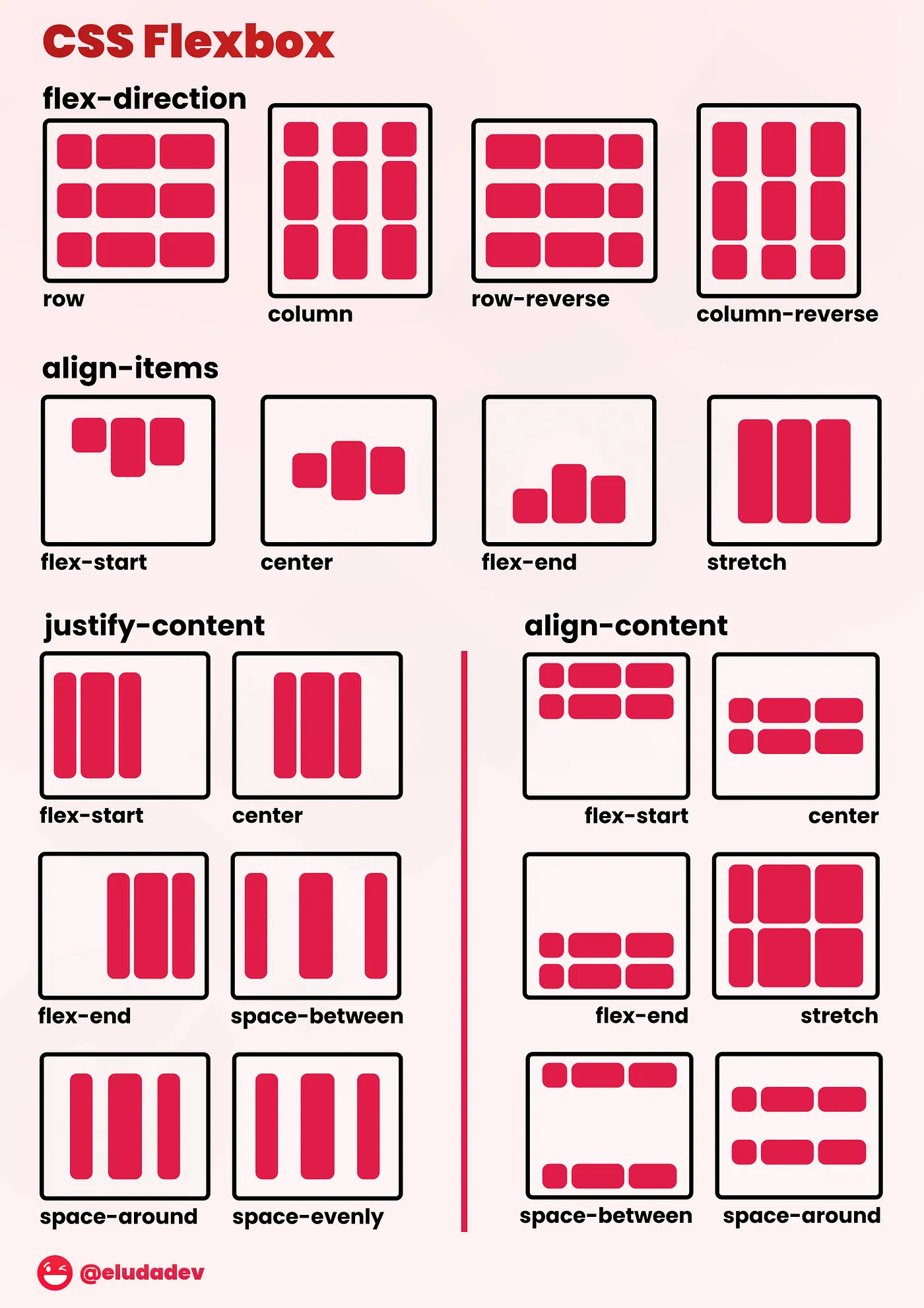
Flexbox is incredibly handy for building responsive user interfaces. As you adjust the document viewport, elements will automatically adjust their size and placement to fit their flex constraints. The CSS-Tricks guide provides a very helpful tutorial on all the flex constraints you can use.

CSS Grid
CSS Grid is another powerful layout system. You can leverage CSS stylesheets to declare named regions of your document, dividing them along fixed or flexible grid lines. Several online tools exist that provide a graphical interface for building grid layouts.
Fixed Position Layout
Occasionally you'll need to reach for fixed-position layouts. These tend to be less flexible than CSS Grid and Flexbox, but make it possible to implement features like sticky headers and dynamically-positioned content.
Icons and SVG
Dioxus supports several approaches for including icons and SVG graphics in your applications.
Inline SVG
You can include SVG directly in your RSX:
fn IconButton() -> Element {
    rsx! {
        button {
            class: "flex items-center gap-2 px-4 py-2 bg-blue-500 text-white rounded",

            // Inline SVG icon
            svg {
                width: "16",
                height: "16",
                viewBox: "0 0 24 24",
                fill: "currentColor",
                path {
                    d: "M12 2l3.09 6.26L22 9.27l-5 4.87 1.18 6.88L12 17.77l-6.18 3.25L7 14.14 2 9.27l6.91-1.01L12 2z"
                }
            }

            "Star"
        }
    }
}
SVG Assets
For larger or reusable SVG files, you can store them in a separate file and import them with the asset!() macro.
fn Icon() -> Element {
    rsx! {
        img {
            src: asset!("/assets/logo.svg"),
            alt: "Logo",
            class: "h-8 w-8"
        }
    }
}
Icon Libraries
You can also use Rust crates that provide icon collections. Several libraries exist:
- Dioxus Free Icons - The FreeIcons library for Dioxus
- Dioxus Material Icons - Google's Material Icons library for Dioxus
- Dioxus Hero Icons - The HeroIcons library for Dioxus
use dioxus_free_icons::{Icon, icons::fa_solid_icons};

fn App() -> Element {
    rsx! {
        Icon {
            width: 30,
            height: 30,
            fill: "blue",
            icon: fa_solid_icons::FaHeart
        }
    }
}
Using dangerous_inner_html
If you want to include icons from their raw HTML representation, you can use dangerous_inner_html which sets the content from a Rust string:
rsx! {
    svg { dangerous_inner_html: r#"<path d="M256 352 128 160h256z" />"# }
}